The campaign results feature is available to rapidly analyze your direct mail appeals.
In the Report tab you will find Campaign Results. Key metrics include: the number of recipients targeted in the campaign, total amount raised and ROI. You can download and export these results to share with your wider team.
Clicking into specific campaigns will allow reveal graphs related to the accuracy of the Dataro predictions made before the campaign. Note: these results are only available for DM appeal campaigns.
The 'Dataro Curve' shows if Dataro's predictions were accurate and will look something like this:
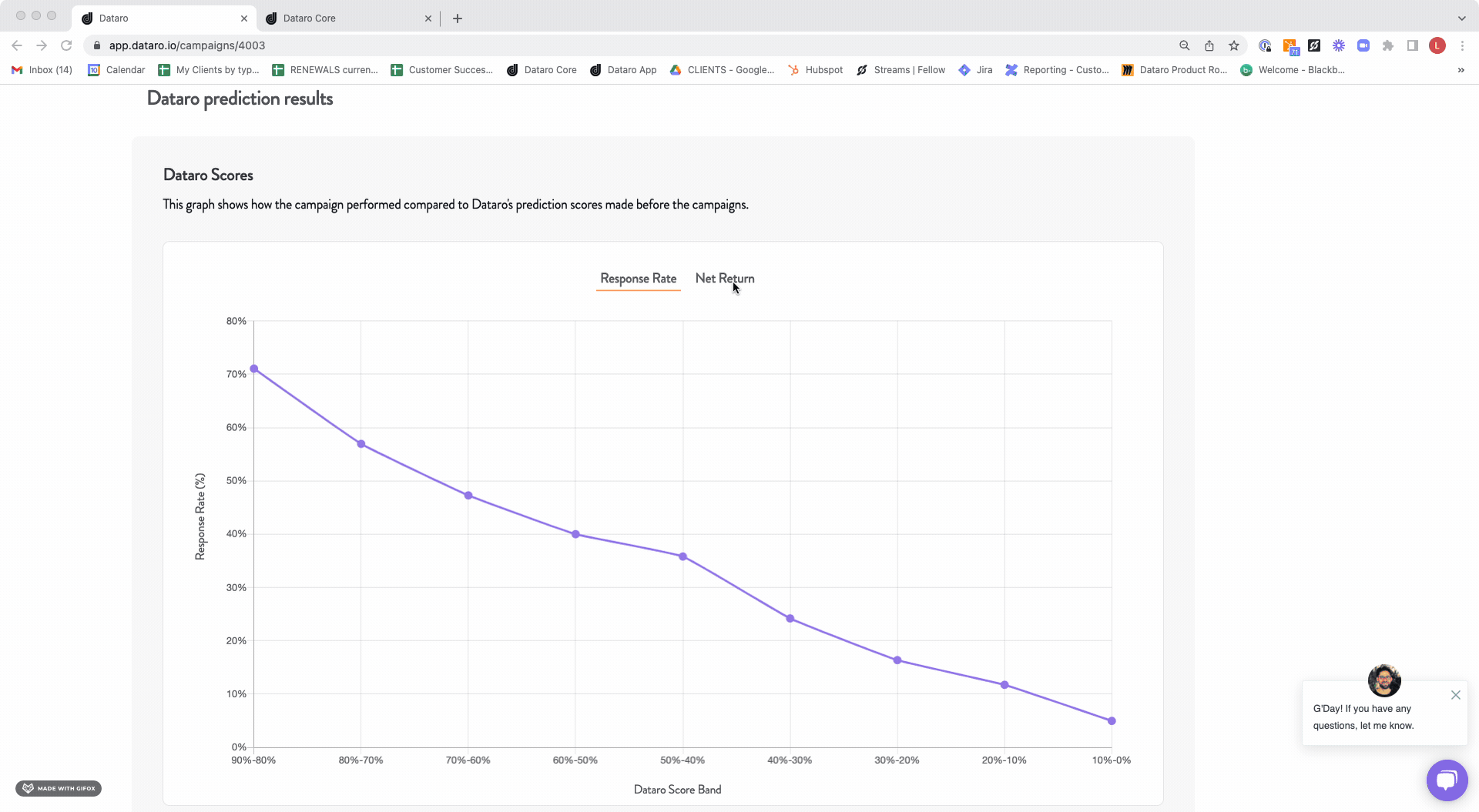
Dataro uses a process called 'calibration' that allows us to convert our predictive scores into rough probabilities. These are only approximations, but are very useful for interpreting results. So a Dataro Score of 0.9 should equate to roughly a 90% chance of giving, score of 0.1 would be a 10% chance of giving, and so on. Of course there is a margin of error, but the trend should be that higher scores correlate with higher response rates.
The graph shows Dataro’s predictions against the actual response rate for the campaign. You can also view the net return of each score band to see which bands are performing well and which may need to be reviewed.
If you have stored your data with sub campaigns you will also see the breakdown of these results and the option to edit the costs.
Which campaign results are available?
Campaign results are available for the following types of campaigns:
- Direct Mail Appeals. In order for campaigns to be displayed, they must be tagged appropriately through the Campaign Tagging process. For example, Direct Mail appeals must be tagged with the Category as "Appeal" and the Channel as "Mail" in order for the campaign results to be shown.
Please note that for recurring giving campaigns, results can be found in Campaign Insights.